


Showing posts with label Self Initiated. Show all posts
Showing posts with label Self Initiated. Show all posts
Saturday, 7 August 2010
Vector Images
Just some work making simple vector images as a test. Going to be doing some work up in the union and want to see how the mixed collage effect looks. Super rough at this stage


Monday, 2 August 2010
Placement starts today
Today I am lucky to be starting a two week placement with agency Gyro:Hsr. They are a huge agency with offices all over the world as well as Manchester and London. Having done some very neat work for companies like Sony, Shell and Pitney Bowes, they certainly look like an interesting place to work. Hoping to learn more about how to work in a professional environment and more about working quickly on good ideas, rather than spending time deliberating over several ideas as we do whilst at university.
After my previous placement at howies clothing company I definitely improved. I learned how to use software better, the benefit of simple neat typography and imagery and a lot about layout. Looking back I don't think I projected myself too well and that's something I'll work on this time.
First thing learned is I don't need to get up at 7 for a job which is only 2 miles away.
Monday, 26 July 2010
A Different Approach
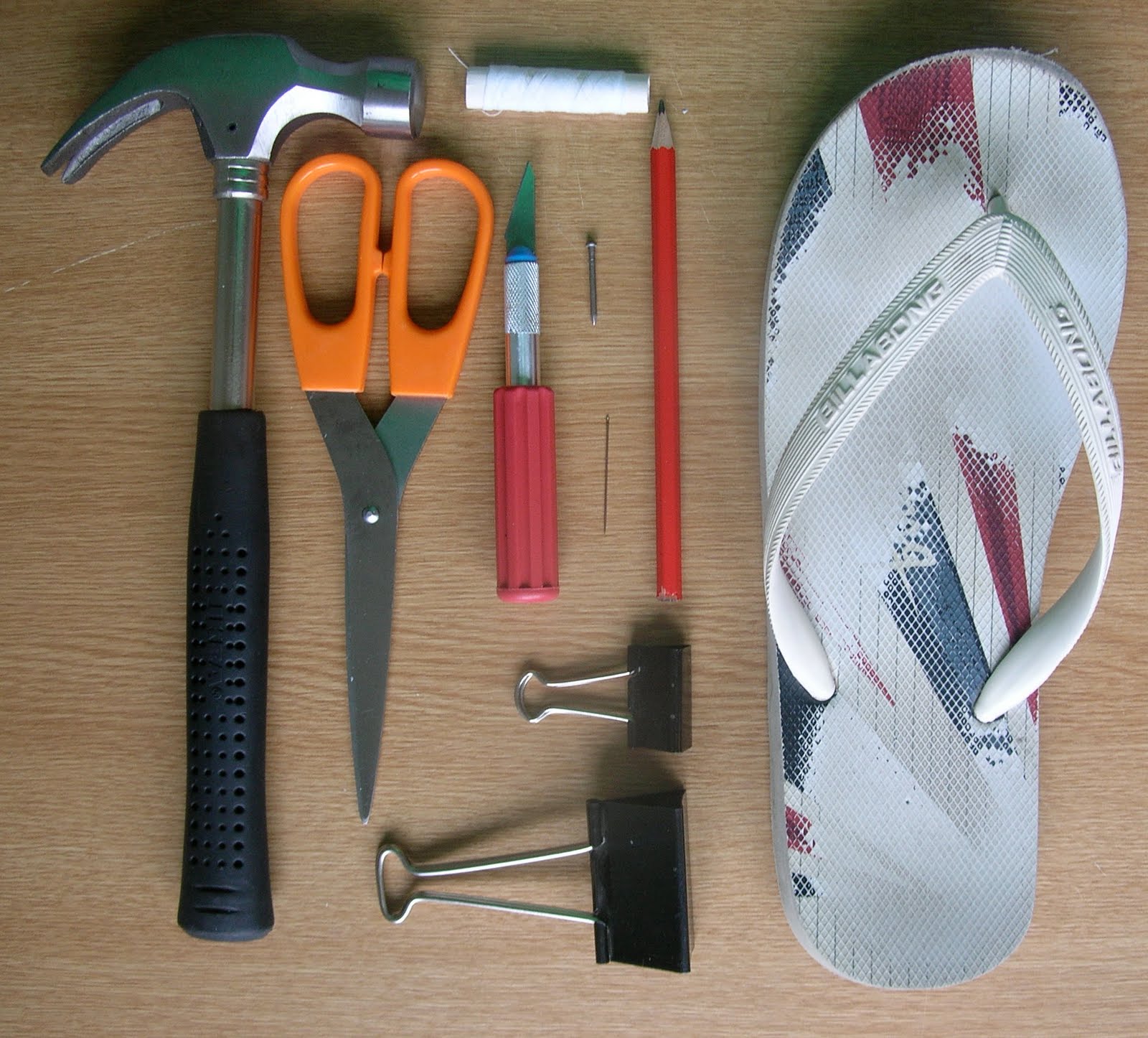
As you may have noticed I have been attempting to make some map based notebooks recently. Due to the fact I'm not allowed to use University equipment whilst in between my now finished degree course and yet to start MA course I have had to make do with some slightly odd equipment in an effort to bind my notebooks....I think my sourcing of household items and converting them into book binding equipment is a triumph and if your bookbinding kit doesn't include a hammer, a nail, a flip flop, an old mousemat and a jar of pennies you're doing it wrong.
Here is just a snippet of the equipment pressed into action

Here is just a snippet of the equipment pressed into action
Sunday, 25 July 2010
To follow up from earlier...
Here are some terrible pictures to show the development of my map based notebook. 64 blank pages to write on, the opposite page is a detail from the original map. The very centre spread features a double page spread of the map detailing.
For production versions I think I would screen print lines and maybe page numbers onto the blank pages. Also I would like to use a news print or butcher paper style stock to make things a bit crisper.
Shall be talking to some folks later on an idea of how to further push the idea so further refinements and additions shall be made.


For production versions I think I would screen print lines and maybe page numbers onto the blank pages. Also I would like to use a news print or butcher paper style stock to make things a bit crisper.
Shall be talking to some folks later on an idea of how to further push the idea so further refinements and additions shall be made.


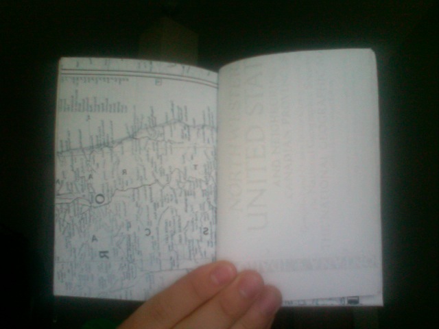


The book is created by printing A4 pages of the scanned map, cutting down to A5 and stacking the resulting A5 images all in the same direction and stitching with a simple saddle stitch. Hence the reason for the double page spread in the middle and the first half of the book having the image on left hand page and the second half on the right hand side. The cover is thick card with a description and space for writing the owners name affixed across the spine. This would definitely be changed for production of the notebook
Maps
I like maps, especially old ones. So I went and bought one from e-bay. Now I'm the proud owner of a 1952 map of the Northwestern US. The terrible picture below does it no justice at all. I shall be scanning and bookbinding for the rest of the day to turn this beautiful old map into a crisp new notebook or two. Going to look great, or at least I hope so.


Thursday, 22 July 2010

Wednesday, 21 July 2010
Top Secret
I can't tell you what this is for, but it's going to be awesome and I am very thankful to Mr. Scanlon for asking me to get involved. More details to come


Thursday, 18 March 2010
PANIC!
We (3rd year D&AD) are having a show based upon the theme of panic coming up soon, we are meant to be showing a rough version of what we're doing today so I pulled this together over a few export strength Guinness's last night. I was much happier with it last night than I am this morning, probably something to do with the aforementioned Guinness but hey, it was St.Patricks day and it's only a rough.

All the little woodland creatures are meant to make a face and there will be some type talking about woodland areas being taken over by evil conglomerates added at a later point once I've repositioned everything and changed the background out (that was never staying, it was just an experiment). The panic part of the brief is answered by the panic of the poor little animals worrying (in fact panicking) about where they will live, and then people worrying about how we have squandered all our countries areas of beauty and nature in an effort to get more supermarkets.
I think this piece is heavily influenced by the greatest kids TV show/books ever 'The Animals Of Farthing Wood', what can I say, I was an impressionable child.
Saturday, 20 February 2010
T-shirt idea and TAP stuff
Got a few ideas for some T-shirts to try and raise some funds for the degree show, here's one for now.

The DIN typeface is mint, thanks to Jon Hannan for loaning it to me....
Also got a final version (for now) of the access project charity booklet.
Monday, 15 February 2010
Illustration
I used to think I'd be an illustrator, I love drawing and doodling, sketching and scribbling, I also like alliteration as you may be able to tell... Anyhow since I joined the D+AD course any attempts at making anything illustration related have been met with luke warm (at best) responses, so when my friend Sian asked me to illustrate some old photos for her I was slightly nervous about making a pigs ear of the whole thing and ruining her Grandfathers birthday.
Not one to let something as trifling as the ruination of a beloved Grandparents birthday bother me I had a go anyway, here is one of my efforts


Not one to let something as trifling as the ruination of a beloved Grandparents birthday bother me I had a go anyway, here is one of my efforts


Tuesday, 29 December 2009
Hope/Nope
Continuing from yesterdays theme of taking Shepard Fairey/OBEY's pro Obama campaign posters and turning them into an anti Brown posters I present this lovely little poster for your viewing pleasure.


Changes from yesterday include, adjustments to Browns blazer, some small differences with the shading, a border has been added and a quick change from HOPE to NOPE.
Original and my version to follow.


The rest of the day will be spent writing essays, enjoy the posters and I shall be posting again soon with work for The Access Project and an amended essay for those of you fancy some light reading
Monday, 28 December 2009
We need a change
When I first saw the OBEY campaign posters for president (senator at the time) Obama I was really impressed by the clean, stylistic approach of them. It seems that most candidates can get some aging rock stars and actors to back their cause these days but what they should really want is someone like Shepard Fairey of OBEY making an instantly recognisable and more importantly, cool, poster campaigns. With a simple colourway, clean, prophetic typography and a link to a world famous designer they couldn't fail. Here are the posters for anyone who hasn't seen them before.


And here is my version. Whereas America needed to change to Obama, we need to change from Gordan....

Subscribe to:
Posts (Atom)


